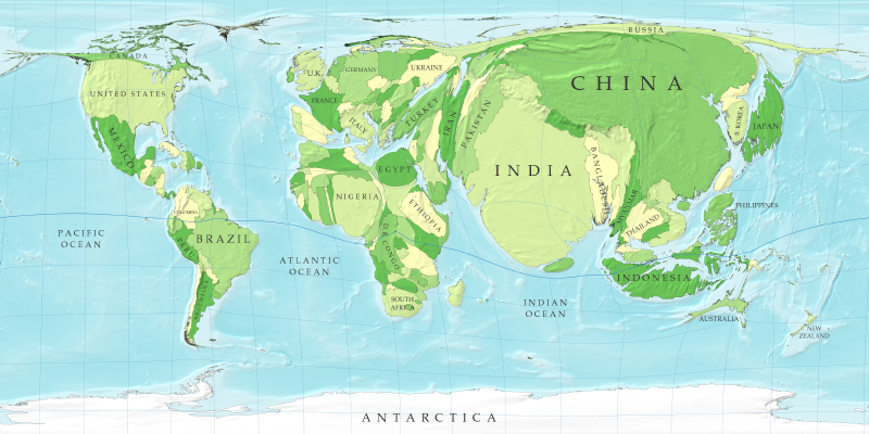
The above map from the University of Michigan has been distorted to show the proportion of populations to the amount of land within individual countries. I really like this map because it is a clear way to show where there are large populations of people living in the world, like China and India. I also like the way this map changes my perspective of the world. For example, I normally think of Russia as a huge country. However, when you think of Russia in terms of how many people there are in proportion to the land, Russia looks extremely small and thin. I also appreciate this map because it is very unique compared to other maps which might show the same information thematically. The bloating of heavily populated countries and the shrinking of sparsely populated countries is very striking and relays the population information to the viewer instantly.
Image Source: "Cartograms: Images of the Social and Economic World" - http://rehydrate.org/resources/cartograms.htm
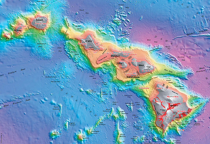
The map above from the Scripps Institute of Oceanography is a relief map of the islands of Hawaii. I find this map interesting because you can see where all the volcanoes are located, as well as the changes in elevation on the island and water depth based upon the use of gradient colors. I also really like that the map clearly illustrates where the volcanoes are located and even shows the pathway of lava flow. The fracture lines at the left of the map, as well as in the upper right corner of the map are very detailed and precise.
Image Source: "Surface Relief Map- Hawaii" - http://earthguide.ucsd.edu/eoc/teachers/t_basics/t_maps/p_hawaii.html
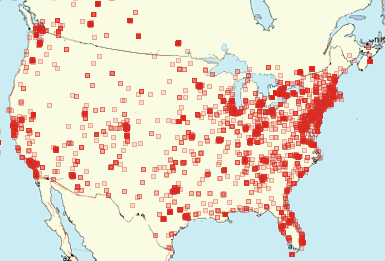
My third selected map is of the distribution of bed bugs in the United States. This map illustrates how reported bed bug sightings cluster in certain parts of the United States. For example, there seems to be bright red clusters, indicating high incidences of bed bugs, in highly populated areas in California. In particular, the Los Angeles area and the Bay area are particularly red and clustered. There is also high levels of clustering in the East Coast. This clustering shows how certain regions of the United States seem to have lots of bed bugs, while other regions have very little to no bed bugs. I also like the way this map was created. The data from this map was created by an online registry, called The Bed Bug Registry, where anyone in the United States or Canada can contribute to the data pool by reporting bed bugs on the website. It's pretty interesting, because the map is constantly evolving and displaying new data. However, this might mean that some past data could eventually become outdated if bed bugs in a particular area eventually become eradicated.
Image Source: "The Bed Bug Registry" - http://bedbugregistry.com/
No comments:
Post a Comment